Using The Art Institute of Chicago [Prints and Drawings]

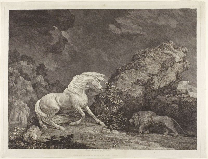
Back in early August 2011 I wrote a piece on using the “Yale Center for British Art.” For the first time ever, I finally understood why book and art historians talk about how enjoyable “working with the object” is. There’s something exhilarating about being in close proximity with the cultural documents we study–whatever the medium. This term, I dropped by the Art Institute of Chicago to conduct research. The institution’s collection presents phenomenal opportunities for visual studies scholars (Art History, English, or otherwise) of the eighteenth- and nineteenth-centuries to engage in direct object study. While this post will be followed by a sequel this spring–when I’ll be looking at some paintings in the collection for a seminar on the interior in art–this autumn’s primary course research falls on animals. Since the Art Institute has a wonderful impression of George Stubbs’s “Horse Frightened by a Lion” (fig. 1),

Fig. 1. George Stubbs. “Horse Frightened by a Lion.” Etching with Engraving on Paper, 13.59 x 18.11 in. (34.50 x 46.00 cm.), 1777. 1982.498. Art Institute of Chicago, Chicago, IL.

I found myself in the Art Institute’s Prints and Drawings Department. In what follows, I’ll describe how to best access the Prints and Drawings Department at the Art Institute, what information to assemble beforehand to use this resource effectively, and describe how the Art Institute structures visiting scholars’ interaction with their prints and drawings collection. From there, I’ll close with some remarks on what I got out of visiting the Art Institute for my own research this first time and by sharing some advice based on what I’ve gleaned from direct object study. In the end, what I hope you get from reading this blog post is an impetus visit Chicago and the Institute and, for some readers, a new way to think about how to approach visual art objects in your research.
Getting There: What’s the best part about the Art Institute of Chicago? Its central location in the Midwest. With Southwest Airlines’s third-largest hub positioned at Chicago-Midway and with United Airlines’s headquarters at Chicago-O’Hare International, getting to Chicago is easy given the number of inexpensive non-stop flights between these two airlines’ route networks. Both airports are directly linked to the Art Institute by the CTA “L” line (the paradigmatic Chicagoan mode of public transportation). What this all means is that one can catch a direct flight that leaves for Chicago early in the morning, arrive for the only appointments that the Prints and Drawings Department offers in the afternoon, spend about three and a half hours viewing artworks, and then still have time for dinner downtown before heading back to the airport for an evening flight home. Traveling to the Art Institute can be incredibly cost efficient.
Amassing Information Beforehand: In my experience doing direct object research it’s best to have a primary object of interest in mind, and then subsequently stage other objects in a given collection next to it to create meaningful avenues of comparison to bounce ideas off. I knew I wanted to look at this particular Stubbs work, and knew it was in the collection. So in building my trip I spent some time researching what other prints were in the Institute’s collection that matched up to a project on “horse art” (I chose two: Eugène Delacroix’s Cheval Sauvage and Albrecht Dürer’s The Small Horse, but you can view up to ten works on a single visit). Upon selecting the prints to look at, I used Zotero to sketch my preliminary ideas on why I was looking at what, and to make note of the accession numbers which match the object with their location in museum storage (these typically take the form of the year the work was acquired, followed by another number—for location purposes). I returned to these numbers when I emailed the Prints and Drawings Department to make an appointment, since this is the data the curatorial staff will use to pull the art you want to look at (as opposed to title/artist).
Arriving at The Art Institute & The Experience of Viewing: Upon arrival, you’ll want to check in at the front desk, as opposed to purchasing a ticket to view the museum exhibitions. A fellow from Prints and Drawings will escort you to the department. You’ll first receive a brief introduction to working with objects, after which you’ll enter the study room. Here, the works you and your colleagues of the day are set to study will already be put up on easels around the room’s periphery.  There are tables in the center of the room were you can leave your laptop and/or pad of paper and pencil while you look closely at your chosen selections. In my experience, at this point, I grabbed my magnifying glass and was off to the races. While I was used to having the works I’ve looked at presented right in front of me, I ended up appreciating the time it took to walk back and forth—from the art to my laptop on the center table—between taking notes, since it forced me to meditate a bit more on the ideas the objects were generating for me. It was a different structure of interaction, but I liked it.

Conclusion: Even with the fabulous facsimiles and reproductions we’re privy to as 21st-century emerging scholars, I still always end up finding things in person I don’t see under any other circumstances. In this case, it was the sense of facture in terms of the organization of the print according to diagonals that lead the viewer’s eye in certain ways across the pictorial surface. But, in the end, what can I say? As much as I love to read theory, there’s just something about reveling in objects that moves me in a way that nothing quite else does–even when it comes to reproducible media, like prints. So while I recognize that most of the NASSRgrads readership has engaged in some form of direct object study in England, or elsewhere on the continent, I’d encourage everyone—who hasn’t, already—to visit some visual art objects. Indeed, one might even be surprised by what’s accessible at your own institution’s library special collections and university art museum (I was astonished at how many Blake holdings there are at Deering Library here in Evanston, for instance). In the end, seeing prints that weren’t on show at the Art Institute was a valuable experience for me—and I can’t wait to do the same with some nineteenth-century paintings in the spring.
And (last): looking forward to seeing many of you and hearing your papers in Tempe next month!


Processing the WPRP Exhibit; Or, Making an Argument with Books in Cases

The Women Poets of the Romantic Period (WPRP) exhibit, called “Landmarks,” is just a few weeks away from opening in CU Libraries. The opening is set to coincide with the June 7 start of the 20th-Anniversary British Women Writers Conference, an international professional-level conference that I am co-organizing this year. When we’re done curating the WPRP exhibit, we’ll have an in-house exhibit in 8 enormous cases in the Rare Book Room as well as an online exhibit of around 20 scanned works and extended explanatory captions, photographs, and a video production. I’ve been feeling less like a dissertating PhD student and more like a contestant on Project Runway lately, working with fabric, mylar, props like shells and even a preserved spider, a museum exhibit designer, photographers, a period music consultant, and even videographers. The cast of collaborators is long and brings together librarians; graduate students in English, musicology, and museum studies; undergraduate library assistants; computer scientists and media artists; literary and art historians; and more. And thanks to the extremely friendly and collegial tone set by Debbie Hollis, the head of CU Libraries Archives and Special Collections, we are happy and very busy collaborators.
At this point, the cases are full and designed and objects are most likely in their final places, though I will no doubt futz with them more as we near the exhibit opening. My current task is to compose the script for the photographer/videographer of the exhibit and to serve as the general editor of the large collection of captions that will describe these objects online and in the video. In other words, I’m documenting the argument that I want the objects on display to make. Or rather, as I’ve found, I’m documenting the argument that the objects on display create. (I will publish these on my blog when they are complete and my collaborators are ready to release them.)
When making arguments with objects in cases, the objects, like Keats’ Grecian Urn, are anything but silent. The objects seem to arrange themselves first and the argument reveals itself afterward. This process is more physical and far less of the purely cerebral process that I have grown so used to with writing essays or dissertating. Trying to make the objects’ display conform to the argument I imagined for them did not work for me. After working with them for a year, I’ve been influenced as much by the physical and visual qualities of these books, pamphlets, manuscripts, and letters as I have by their textual content. I have spent far more time working with some of them than with others — for example, I painstakingly transcribed Mary Cockle’s letter and then worked with Susan Guinn-Chipman, another colleague in Special Collections, to piece together the parts that were difficult to read. Due to the time spent handling and reading these artifacts in cradles, in the stacks, on shelves, and on tables in Special Collections, and also the occasions I used them to teach my undergraduate literature classes, I have been influenced by their physical properties and arrangements in space and these traits have influenced my attentions and the argument I feel that the exhibit makes.

My argument for this exhibit, therefore, is based heavily on physical constraints and visual properties of the exhibit as well as my research gathered from reading these literary artifacts and thinking about them in the context of the Romantic literary era. Curating the exhibit was a mixed process of object placement based on:

  • the 200+ works in the collection that I read from June 2011 through January 2012 (my reading list was based on numerous factors, including titles and spines that grabbed my attention, ability to find them on the shelves, recommendations from other scholars, personal interests, and more)
  • pragmatism (certain objects only fit in certain cases)
  • aesthetics (certain objects only show well in certain cases)
  • my personal research interests (visual media, travel writing, the picturesque, and the gothic)
  • the arc of my desired argument as the path from one case or section to the next
  • the arc of the argument that the objects, when placed in the display cases, created and that influenced the argument I set out to make.
  • other factors I’m unintentionally leaving out

For example, the argument that I set out to make was focused on the collection as one that lent itself to the study of travel writing in the Romantic era, how print traveled, and what that had to do with women authors and complex relationships between form and gender in print culture. However, when placing objects in the front of the exhibit, in the cases closest to the door, I realized that the exhibit is as much about changing ideas of what constitutes the domestic as it is about that which lies beyond the home. This realization grew out of thinking about the Stainforth’s position in the case next to the literary annual with the beaded cover, and after pulling the Taylors’ Rhymes for the Nursery out of this case to place elsewhere. This led me to rethink the thematic organization of the exhibit. Originally, there were just two categories–natural destinations and social destinations–but these quickly expanded into three to include the domestic as our starting place. Furthermore, between the domestic and natural destinations, I noticed a collection of works, including the Taylors’ numerous works of children’s literature, that engage the Gothic aesthetic and provide a link between home, nature, and social destinations. I settled on four categories and a flow from book objects representing the domestic and home, to the gothic, to nature, and finally to social destinations and social movements. (Of course, many of these books could be placed in multiple categories.)
Perhaps a good question to ask is: where is the argument in this exhibit? Does it emanate from the objects’ placements, the path of the visitor/viewer through the exhibit, or my textual explanations of the relationships between these objects and their home in the greater collection? How does the digital exhibit and collection influence or affect the in-house exhibit, and vice versa? And what about the additional documentary components of video and photography of the exhibit? It’s a lot to curate and even more to interpret. I admit that from where I stand right now, I’m lost in the process and on deadline, to boot.
As we know, readers and interpreters will read and interpret how they will; one cannot force readers’ paths of critical attention any more than I can control which case visitors to this exhibit will want to look at first. The case by the door is the obvious choice, but who knows, a viewer may be drawn to the red cloth in the Gothic case in the back of the room, or the promise of the spider specimen hidden therein. Despite my lack of control, I will offer my exhibit argument as a way to thoughtfully present a microcosm of the magnificent ~500-work WPRP collection. The argument and the path from case to case will, in theory, lead scholars, readers, and visitors into the collection either in the Rare Book Room or online and will draw renewed attention to Romantic-era women poets who are have changed print culture and literary history.
[Author’s note: this post was originally published on my research blog: http://kirstynleuner.wordpress.com.]